10 AI Prompts for Comparison Visuals
Create stunning visual comparisons with 10 AI prompts for design trends. Create side-by-side visuals for UI/UX, tech evolution, and fashion using professional styles.
Visual comparisons are one of the most powerful ways to communicate change, progress, or choice. Whether you are showcasing a “before and after” home renovation, comparing the evolution of technology, or highlighting the difference between two design styles, a clear side-by-side image tells a story instantly.
Comparison visuals have evolved to include tactile textures, glassmorphism, and mixed-reality elements that make the contrast even more striking. This collection provides professional-grade prompts to help you generate high-quality comparison images for any project.
Key Takeaways
- Symmetry is Key: Balanced compositions make it easier for the viewer to spot differences quickly.
- Lighting Contrast: Using different lighting moods for each side can emphasize the emotional shift between two scenarios.
- Texture Matters: Incorporating 2026 trends like “puffy” or “tactile” materials adds a sensory layer to the comparison.
- Style Consistency: Keeping the camera angle and lens type consistent across both halves ensures the comparison feels fair and professional.
Comparison Visuals AI Prompt Collection
Prompt 1: Glassmorphism 2.0 UI Comparison
Use Case: Showcasing the evolution from flat design to modern translucent interfaces.
A side-by-side comparison of two mobile app interfaces, the left screen showing a standard flat design with solid colors while the right screen features Glassmorphism 2.0 with translucent frosted glass panels and soft diffused background blurs, bright studio lighting, centered eye-level composition, shot with a 35mm lens, high-quality realistic digital rendering, professional UI/UX design style, sharp interface details.
Prompt 2: Tactile Material Evolution
Use Case: Comparing traditional rigid product design with futuristic flexible materials.
A product comparison visual of two athletic sneakers, the left shoe having a classic leather and rubber construction while the right shoe features a futuristic puffy and squishy foam texture in vibrant neon green, soft overhead studio lighting, medium shot, 50mm lens, sharp focus on tactile material details, high-resolution textures, clean grey background, realistic 2026 product photography style.
Prompt 3: Digital Artifacts Artistic Split
Use Case: Demonstrating the intersection of high-resolution photography and intentional AI art.
A vertical split-screen portrait of a woman, the left side is a crystal-clear high-definition photograph while the right side is processed with intentional digital artifacts including pixelation, compression noise, and color banding, soft natural window light, close-up composition, 85mm lens, high-quality artistic contrast, representing the intersection of human and machine, professional editorial photography style.
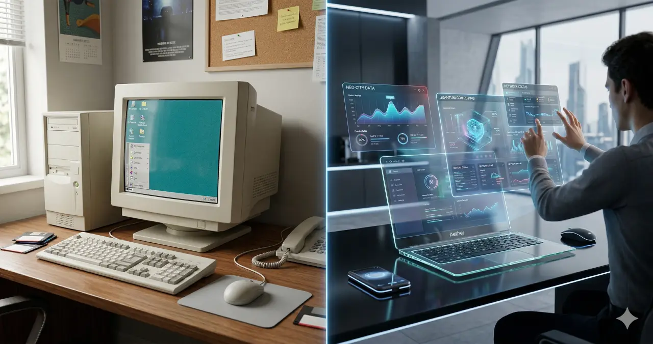
Prompt 4: Y3K Automotive Comparison
Use Case: Visualizing the shift from vintage mechanical power to futuristic electric tech.
A wide landscape comparison showing a vintage 1960s muscle car on a desert road next to a futuristic Y3K electric vehicle with a polished chrome finish and glowing cyan neon accents, golden hour lighting, cinematic wide-angle shot, 24mm lens, high-quality realistic lighting, sharp horizon line, merging mid-century optimism with futuristic technology, highly detailed textures.
Prompt 5: Bento Grid Organization
Use Case: Highlighting the benefits of modular layout over traditional chaotic data displays.
A top-down comparison of two information layouts, the left side being a cluttered and unorganized spreadsheet while the right side is a clean and modular bento grid layout with balanced sections and rounded corners, bright uniform office lighting, flat lay composition, high-quality overhead shot, 35mm lens, crisp focus, realistic paper and screen textures, professional organizational style.
Prompt 6: Biophilic Architecture Flow
Use Case: Showing the contrast between traditional concrete structures and organic green buildings.
A cinematic comparison of two urban buildings, the left being a standard grey concrete skyscraper and the right being a 2026 organic flow structure with biophilic curves and integrated hanging gardens, bright midday sunlight, drone aerial view, high-quality architectural photography, 35mm lens, vibrant greens against sterile greys, realistic environmental textures, sharp and clear composition.
Prompt 7: Saturation Revival Marketing
Use Case: Comparing past-season muted colors with 2026 high-contrast brand palettes.
A marketing visual comparing two cosmetic product sets, the left featuring muted pastel packaging and the right showcasing a saturation revival palette with deep chocolate brown and acid orange accents, high-contrast studio lighting, centered eye-level composition, 50mm lens, professional commercial photography, sharp details, bold and energetic color fields, realistic plastic and glass textures.
Prompt 8: Scrapbook Style Layout
Use Case: Demonstrating a move from rigid social media grids to layered creative collages.
A comparison of two digital mood boards, the left having a rigid square grid of images and the right using a 2026 scrapbook style with layered textures, ripped paper edges, and overlapping hand-drawn doodles, soft diffused lighting, flat lay perspective, high-quality mixed media aesthetic, 35mm lens, creative and personal storytelling feel, high-resolution details.
Prompt 9: Mixed Reality Learning
Use Case: Showcasing the shift from physical textbooks to 3D holographic education.
A medium shot comparing a traditional learning environment where a student reads a flat textbook on the left and a mixed reality setup on the right where the student interacts with a floating 3D holographic solar system, soft cool studio lighting, 50mm lens, high-quality digital integration, realistic depth and layering, modern educational style, sharp focus on the student’s expression.
Prompt 10: Neo-Minimalist Interior
Use Case: Comparing cold minimalist design with the warm, grounded earth tones of 2026.
An interior design comparison of a living room, the left side showing a cold all-white minimalist space and the right side demonstrating 2026 neo-minimalism with deep sage walls and chocolate wood furniture, warm natural evening light, wide-angle cinematic shot, 24mm lens, high-quality architectural render, cozy and grounded atmosphere, sharp interior details and textures.
Use Cases
- Product Marketing: Compare a current product model with its next-generation counterpart to drive upgrades.
- Case Studies: Show “before and after” results for services like home staging, skincare, or web design.
- Educational Content: Visually explain the difference between two complex concepts, such as energy sources.
- Social Media: Create high-engagement “this vs. that” posts to spark community debate and interaction.
- Pitch Decks: Use comparison visuals to demonstrate the value of your solution against traditional methods.
Example User Inputs
Show a comparison between a standard office and a biophilic office designGenerate a visual comparing a 1950s kitchen with a 2026 smart kitchenCreate a split-screen image showing a dry desert next to a lush forestCompare a messy gaming setup with a clean minimalist desk setupShow the difference between a traditional watch and a futuristic wearable device
Why Use These Prompts
These prompts are specifically designed to leverage the most recent design trends of 2026, such as Glassmorphism 2.0 and Tactile Textures. Instead of simple side-by-side images, these prompts incorporate specific lighting, camera lenses, and style markers that ensure the output looks like professional photography or high-end architectural renders. This saves you hours of manual editing and helps you maintain a consistent brand aesthetic.
How to Use These Prompts
- Select a Prompt: Choose the comparison style that best fits your niche (e.g., UI/UX, Architecture, or Fashion).
- Customize the Subject: Swap out the “Subject” in the prompt if you need a specific product or scenario.
- Run in an AI Generator: Paste the paragraph into your preferred AI image tool.
- Refine the Aspect Ratio: For side-by-side visuals, use a widescreen aspect ratio (like 16:9) to give both sides enough room.
Who Can Use These Prompts
- Graphic Designers: To create quick mockups and concept art for clients.
- Content Creators: For eye-catching YouTube thumbnails or Instagram carousels.
- Architects & Decorators: To visualize renovations and design shifts for presentations.
- Tech Bloggers: To show the evolution of hardware and software visually.
- Marketing Agencies: To develop high-converting ads based on product comparisons.
Disclaimer: AI-generated images may occasionally struggle with perfectly symmetrical text or complex logos. If your comparison requires specific branding or text, we recommend adding those elements during the post-production stage using graphic design software.
Explore Mega-Prompt Resources
-
Mega-Prompt Categories
— Browse all categories -
Persona Mega-Prompts
— Industry personas -
Healthcare Mega-Prompts
— Clinicians & admins -
Image Generation Prompts
— Art & visuals -
Content Creation Prompts
— Blogs, copy, scripts -
Marketing Prompts
— Growth & campaigns -
Prompts Tricks & Tips
— How-tos & guides