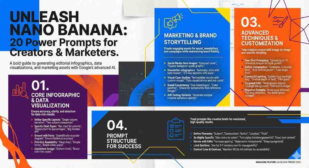
Designing consistent, high-impact infographics with Google’s Nano (Banana) models becomes dramatically easier when you start from strong, style-specific prompts. Below is a curated collection of 20 unique infographic generation prompts, each with its own visual style, layout logic and use case.
This guide is structured for SEO-focused creators and marketers who want reusable, high-quality prompts they can quickly adapt for different topics, audiences and brands. You will find:
- 20 distinct infographic prompt frameworks
- Each with a clear title, a short style guide and a ready-to-use prompt in blockquotes
- Non-salesy, descriptive language to match informational and educational content
- A final “assets file” section for easy copy-paste and reuse
You can plug in your own topic, data points and branding notes into each template to create an evergreen prompt library tailored to your workflows.
1. Clean Minimal Data Story Infographic
This prompt is ideal for data-heavy topics where you want a calm, modern and minimal presentation with plenty of white space and clear visual hierarchy.
Create a clean, minimal infographic in a vertical layout that explains [MAIN TOPIC] using 4 to 6 key data points. Use a white or very light background with soft, neutral accent colors and simple sans serif typography. Include large, readable headings, concise labels and subtle icons for each data point. Emphasize clarity, whitespace and alignment. Avoid decorative clutter, gradients and busy textures. The design should feel modern, balanced and easy to scan for a professional blog audience.
2. Bold Editorial Magazine-Style Infographic
Use this when you want a strong, editorial feel similar to magazine feature spreads, ideal for thought-leadership and trend breakdowns.
Design a bold editorial-style infographic that presents [MAIN TOPIC] like a magazine feature. Use strong typography, contrasting color blocks, and asymmetrical grid layouts. Include a prominent main headline area, a short subheading, and 3 to 5 content sections with brief text summaries. Add simple icons or abstract shapes to guide the eye. The color palette should be limited but high contrast. Keep the overall aesthetic sharp, contemporary and suitable for a long-form editorial article.
3. Flat Illustration Process Infographic
Perfect for turning a step-by-step workflow or framework into a friendly, illustrated visual guide.
Generate a flat-illustration infographic that explains a step-by-step process for [PROCESS TOPIC] in 5 to 7 stages. Use flat vector-style characters or objects, with clean outlines and solid colors. Arrange the steps horizontally or in a gentle curve with arrows or connectors. Each step should have a short title, one concise description line, and a small flat illustration. Use a soft but colorful palette, consistent icon style and clear hierarchy so the process is easy to follow at a glance.
4. Corporate Dashboard Metrics Infographic
Use this style for KPI reports, marketing performance summaries and analytics recaps.
Create a corporate-style metrics infographic that visualizes key performance indicators for [METRICS TOPIC]. Use a dashboard-inspired layout with neatly organized sections for 4 to 8 metrics. Incorporate simple bar charts, line charts, and percentage callouts. Use a professional color palette with one primary accent color, dark text and light backgrounds. Emphasize legibility, data clarity and alignment. Include concise labels and short explanations under each metric for a business audience.
5. Soft Pastel Educational Infographic
Best for simplifying complex topics for beginners, with a gentle, approachable visual tone.
Design a soft pastel educational infographic that introduces [EDUCATIONAL TOPIC] to beginners. Use a vertical layout with 3 to 5 main sections, each with a heading, 2 to 3 bullet-style points, and a simple illustration or icon. Choose pastel colors, rounded shapes and friendly sans serif fonts to create an approachable feel. Maintain high contrast for text while keeping the overall look calm and reassuring. Avoid dense paragraphs and keep information concise and beginner-friendly.
6. Timeline Roadmap Infographic
Ideal for roadmaps, historical overviews or product journey explanations in a linear structure.
Generate a timeline-style infographic that shows the progression of [TIMELINE TOPIC] across 6 to 10 milestones. Use a horizontal or vertical timeline with clear markers for each date or phase. Each milestone should include a short title, a one-sentence description and a small icon or illustration. Use a consistent color theme with one highlight color to emphasize the current or most important milestone. Ensure the timeline is easy to scan and well-spaced, with subtle lines and connectors.
7. Comparative Two-Column Infographic
Use this when you want to compare two options, strategies or tools in a clear, structured way.
Create a two-column comparison infographic that contrasts [OPTION A] and [OPTION B] across 5 to 8 criteria. Use a balanced layout with mirrored columns, clear headings for each option, and a neutral background. For each row, include a short criterion label and succinct bullet-style descriptions on both sides. Use a limited color palette where each option has its own accent color. Keep icons minimal and consistent. Aim for a structured, objective look that supports side-by-side evaluation.
8. Step-by-Step Checklist Infographic
Great for turning tutorials, checklists or workflows into a visually guided list.
Design a step-by-step checklist infographic that outlines [CHECKLIST TOPIC] in 7 to 12 actionable steps. Use a vertical layout with numbered items, each containing a short title and a one-line action description. Include simple checkboxes or minimal icons for each step. Use a clean, professional color palette with one or two accent colors. Prioritize legibility and spacing so the checklist feels practical and ready to follow. Avoid decorative elements that distract from the steps.
9. Circular Diagram Framework Infographic
Ideal for frameworks, cycles and systems where elements are interconnected.
Generate a circular diagram infographic that explains the core components of [FRAMEWORK TOPIC]. Use a central circle with the main concept, surrounded by 4 to 8 outer segments. Each segment should have a concise label and a short explanatory phrase. Use color blocks or subtle gradients within the circle segments, ensuring text remains easy to read. Include thin connecting lines or arrows to indicate relationships or cycles. Keep the design minimal, geometric and concept-focused.
10. Dark Mode Tech Infographic
Use this when your audience is tech-savvy and you want a sleek, modern, dark UI aesthetic.
Create a dark mode infographic with a sleek tech-inspired style to explain [TECH TOPIC]. Use a dark background with high-contrast light text and one or two neon accent colors. Incorporate clean lines, subtle grid patterns and minimal icons. Structure the content into 3 to 5 main sections with short headings, concise descriptions and simplified diagrams. Keep the overall feel modern, polished and optimized for digital screens while preserving readability.
11. Hand-Drawn Sketch Note Infographic
Great for creative and educational content that benefits from a more informal, notebook feel.
Design a hand-drawn sketchnote-style infographic that summarizes [SKETCHNOTE TOPIC]. Use a light paper-like background with subtle texture. Include doodle-style icons, arrows, banners and highlighted boxes. Arrange content in a loose but intentional layout with 4 to 6 clusters of information. Each cluster should have a short title and 2 to 3 brief notes. Use handwritten or hand-drawn style fonts where readable, with a limited color palette so the design remains clear and not chaotic.
12. Gradient Hero Funnel Infographic
Perfect for marketing funnels, customer journeys or conversion flows with a strong hero section.
Generate a gradient-based funnel infographic that visualizes the stages of [FUNNEL TOPIC]. Use a vertical layout with a clear hero title at the top and a funnel shape or layered sections descending downward. Each stage should include a short heading, a one-sentence description and an optional metric placeholder. Use smooth gradients in a cohesive color palette, combined with clean sans serif type. Keep icons simple and use them sparingly. Aim for a polished, marketing-friendly look.
13. Icon Grid Quick Facts Infographic
Use this when you want to present multiple quick facts or tips in a compact, modular layout.
Create an icon grid infographic that presents key facts about [FACTS TOPIC] using 6 to 12 tiles. Arrange the tiles in a neat grid with equal spacing. Each tile should contain a simple icon, a short title and one concise supporting line. Use a consistent icon style and a restrained color palette with a light background. Ensure that typography is clear and uniform across all tiles. Focus on making each tile independently readable while the full grid feels cohesive.
14. Mind Map Concept Infographic
Ideal for exploring one central concept and its related ideas or subtopics.
Design a mind map style infographic for [CONCEPT TOPIC]. Place the main concept at the center with a clear title. Branch out into 5 to 10 connected subtopics, each with a short label and one brief supporting phrase. Use curved connecting lines, circles or rounded rectangles for nodes. Apply a simple color scheme where each branch or category uses a distinct accent color. Keep the background light and uncluttered. Prioritize clarity of connections and hierarchy of information.
15. Long-Form Explainer Panel Infographic
Great for evergreen educational content that benefits from visual sectioning but more text per section.
Generate a long-form explainer infographic for [EXPLAINER TOPIC] using panel-style sections. Use a vertical layout divided into 4 to 6 horizontal panels. Each panel should include a heading, a short paragraph and a small supporting diagram or icon. Use a simple color system where each panel has a subtle background tint. Maintain generous margins, readable type sizes and a clear information hierarchy. The overall tone should be educational and reference-friendly, suitable for in-depth blog content.
16. Hierarchical Pyramid Infographic
Best for priority stacks, levels, stages of mastery or value hierarchies.
Create a pyramid-style infographic that presents the hierarchy of [PYRAMID TOPIC] across 4 to 7 levels. Use a geometric pyramid with clearly separated layers, largest at the bottom and smallest at the top. Each level should include a short title and one concise description line. Use a gradient or stepped color scheme from base to top, while keeping text highly readable. Include a brief introductory heading and one-sentence summary above or beside the pyramid. Keep the style clean and conceptual.
17. Data-Driven Comparison Bar Infographic
Use this when you have specific numeric comparisons that you want to highlight visually but simply.
Design a bar-chart focused infographic that compares key metrics for [DATA COMPARISON TOPIC]. Use a clean vertical or horizontal bar layout with 4 to 8 bars. Include clear axis labels, value markers and concise titles for each bar. Surround the chart with short annotation boxes or callouts that explain the main insights. Use a neutral background, one main accent color and a secondary highlight color for emphasis. Prioritize data accuracy and legibility over decoration.
18. Process Flow Diagram Infographic
Perfect for systems, workflows or multi-step processes with branches and connections.
Generate a process flow diagram infographic that maps out [WORKFLOW TOPIC]. Use interconnected boxes and arrows to represent 6 to 12 steps or decision points. Each step should have a short label and one supporting phrase. Use a horizontal or mixed-direction layout that remains easy to follow. Apply a professional color palette with clear visual distinction between standard steps, decisions and endpoints. Keep icons minimal and focus on directional clarity and logical grouping.
19. Storyboard Journey Infographic
Use this when you want to illustrate a user journey, narrative or scenario-based sequence.
Create a storyboard-style journey infographic that visualizes the experience of [JOURNEY TOPIC] in 4 to 8 scenes. Arrange rectangular frames in a horizontal or zigzag layout, each representing one scene. Include a small illustration in each frame, along with a short title and one or two lines of descriptive text. Use consistent character or object styling throughout. Choose a coherent color palette and maintain generous spacing. Aim for a narrative flow that is easy to follow at a glance.
20. Multi-Layer Venn and Overlap Infographic
Great for showcasing overlaps between ideas, audiences, or capabilities.
Design a multi-layer Venn-style infographic that highlights overlaps between [CATEGORY A], [CATEGORY B], and [CATEGORY C] for [Venn TOPIC]. Use 2 or 3 overlapping circles with semi-transparent fills so intersections are visible. Label each circle clearly and add brief text descriptions within each overlapping area. Keep the background simple and neutral. Use a restrained color palette where overlaps form distinct blended shades. Prioritize clarity of labels, legibility and conceptual understanding.
In Summary
Creating effective infographics doesn’t have to be complicated. With these 20 diverse prompts, using Google’s Nano Banana model, you can quickly generate visuals that match your specific content needs, whether you are teaching a beginner concept, sharing quarterly metrics, or telling a data-driven story.
Always choose the style that best fits your information and audience, then customize the placeholders to keep your visuals fresh and relevant.
Experiment with different layouts to find what resonates most with your readers, and use these frameworks to save time on design while improving the quality of your blog posts.
Bookmark this prompt post to create stunning infographics to impress your stakeholders.