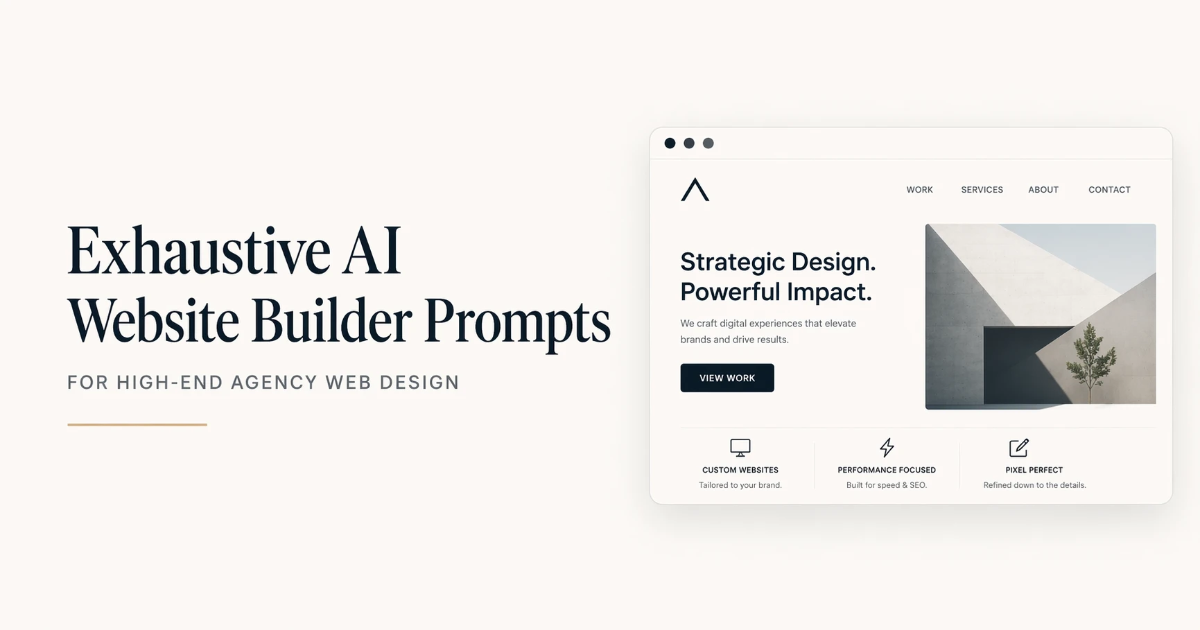
Exhaustive AI Website Builder Prompts for High-End Agency Web Design
Access a comprehensive library of AI website builder prompts. Master site architecture, UI aesthetics, user experience, and conversion optimization like a top design agency.
Building a high-end website requires meticulous attention to every layer of the digital experience. To achieve agency-level results using AI website builders, you must use a highly structured approach.
This exhaustive collection breaks down AI web generation into four critical sub-categories: Site Architecture, Visual Aesthetics, User Experience, and Conversion Strategy.
Site Architecture covers the foundational blueprints, from single landing pages to complex multi-tier site maps. Visual Aesthetics dictates the design language, encompassing color systems, typography scales, and UI component styling.
User Experience addresses how visitors interact with the site, focusing on navigation paths, mobile responsiveness, and interactive states.
Finally, Conversion Strategy targets the psychological layout of pricing tables, hero sections, and social proof to maximize ROI.
Step-by-Step Guide to Using These Prompts
To leverage this collection effectively, treat these prompts as modular frameworks for your design process.
First, determine which phase of the project you are tackling and select the corresponding sub-category. Choose the specific prompt that matches your immediate design task.
Next, copy the prompt into your AI assistant or website builder tool. Locate the bracketed placeholder tags at the end of the prompt and replace them with your precise project parameters, using the provided examples as a guide. Review the AI-generated output, ensure it aligns with your brand guidelines, and iterate on the details before implementing the code or layout in your website builder.
Sub-Category 1: Site Architecture and Wireframing
Prompt Title: Landing Page Structural Blueprint
Brief Use Case Intro: Generates a logical, top-to-bottom wireframe hierarchy for a high-converting landing page before visual design begins.
Act as a lead digital architect and UX strategist to conceptualize the structural wireframe for a new website. The project involves creating a high-converting landing page for a specific industry and target audience. Map out the sequential page sections from top to bottom, detailing the core purpose and layout of each block. Maintain a strict minimalist approach, ensuring no section is redundant and cognitive load remains low. Structuring the information hierarchy correctly before visual design ensures the user journey seamlessly aligns with business goals. Deliver the structural plan as a sequential list of sections, detailing the primary headline concept, supporting elements, and interactive components for each. Target Industry: [Industry], Primary Goal: [Goal], Target Audience: [Audience].
Expected Outcome: A detailed, text-based structural layout detailing the sequential sections of a landing page.
Three user input examples:
- Industry: B2B SaaS, Goal: Free Trial Signups, Audience: Enterprise IT Managers
- Industry: Boutique Coffee Roaster, Goal: E-commerce Sales, Audience: Specialty Coffee Enthusiasts
- Industry: Freelance Portfolio, Goal: Lead Generation, Audience: Creative Agency Directors
Prompt Title: Multi-Page Site Map Generation
Brief Use Case Intro: Develops a comprehensive taxonomy and URL structure for a complex website to ensure logical routing.
Act as a senior information architect to build a complete site map for a growing digital platform. The client needs to organize a wide array of services and resources without overwhelming the visitor. Categorize the main pages, sub-pages, and utility links into a logical hierarchy. Do not create more than three levels of depth for any page to maintain SEO crawlability. A flat and logical architecture helps both users and search engine bots navigate the domain efficiently. Provide the output as a nested list representing the URL structure and parent-child page relationships. Primary Niche: [Niche], Core Offerings: [Offerings], Content Types: [Content].
Expected Outcome: A nested text list detailing the complete website taxonomy and URL hierarchy.
Three user input examples:
- Niche: Real Estate Agency, Offerings: Buying, Selling, Property Management, Content: Neighborhood Guides, Agent Bios
- Niche: Online University, Offerings: Degrees, Certifications, Bootcamps, Content: Course Catalogs, Alumni Stories
- Niche: Healthcare Clinic, Offerings: Primary Care, Pediatrics, Therapy, Content: Patient Portal, Health Blog
Prompt Title: E-commerce Product Page Layout
Brief Use Case Intro: Structures the individual product page layout to balance visual media, descriptive text, and purchasing actions.
Act as an e-commerce UX specialist to design the wireframe for an individual product detail page. You need to create a layout that highlights product features while minimizing friction on the path to purchase. Outline the placement of the product image gallery, title, pricing, variant selectors, description, and trust signals. Avoid cluttering the buy box area with secondary information that could distract from the add-to-cart action. An optimized product page bridges the gap between digital browsing and physical retail by providing all necessary purchase information intuitively. Present the wireframe as a top-to-bottom list of layout modules with specific placement instructions for desktop and mobile views. Product Category: [Category], Key Features: [Features], Trust Signals: [Signals].
Expected Outcome: A modular breakdown of an e-commerce product page optimized for user flow and purchasing.
Three user input examples:
- Category: Premium Sneakers, Features: 360-degree view, sizing guide, Signals: Free returns, verified reviews
- Category: Software Subscription, Features: Feature comparison matrix, video demo, Signals: Enterprise client logos
- Category: Organic Skincare, Features: Ingredient list, usage instructions, Signals: Dermatologist approved badge
Sub-Category 2: Visual Aesthetics and UI Design
Prompt Title: Brand Identity and Styling System
Brief Use Case Intro: Creates a comprehensive design system including typography, color palette, and component styling based on brand values.
Act as a senior UI designer to generate a comprehensive digital styling system and design language. You are establishing the visual identity for a brand that needs to communicate specific core values through its web presence. Define a primary and secondary typography pairing, a cohesive color palette with hex codes, and styling rules for buttons and cards. Avoid overly trendy design elements that may age poorly, focusing instead on timeless, accessible design principles. A well-defined design system ensures visual consistency across all pages and builds immediate brand trust with visitors. Present this as a structured design system document categorized by Colors, Typography, and UI Components. Brand Vibe: [Vibe], Core Values: [Values], Industry Context: [Context].
Expected Outcome: A standardized design system document with hex codes, font pairings, and component styling rules.
Three user input examples:
- Vibe: Dark mode elegant, Values: Security and Innovation, Context: Fintech Startup
- Vibe: Earthy and organic, Values: Sustainability and Wellness, Context: Skincare Brand
- Vibe: Brutalist and bold, Values: Creativity and Disruption, Context: Modern Art Gallery
Prompt Title: UI Component Library Specifications
Brief Use Case Intro: Dictates the specific visual attributes for reusable interface components like buttons, inputs, and cards.
Act as a front-end design lead to specify the styling properties for a core UI component library. The project requires detailed visual specifications for buttons, text input fields, and informational cards to hand off to developers. Define the border radius, padding, background colors, border styles, and shadow properties for each component. Do not use generic terms like “make it look nice”; instead, provide exact CSS-style descriptive values and proportions. Standardized components reduce development time and maintain a cohesive interface as the website scales. Output the specifications as a categorized list detailing the visual properties for the default states of these components. Design Aesthetic: [Aesthetic], Base Spacing Unit: [Spacing], Shadow Style: [Shadow].
Expected Outcome: A technical specification list detailing the physical attributes of buttons, inputs, and cards.
Three user input examples:
- Aesthetic: Neumorphic, Spacing: 8px system, Shadow: Soft and diffused
- Aesthetic: Material Design, Spacing: 4px system, Shadow: Hard drop shadows
- Aesthetic: Flat and minimal, Spacing: 10px system, Shadow: None
Prompt Title: Responsive Typography Scale
Brief Use Case Intro: Calculates a harmonious typographic scale for headings and body text across desktop and mobile viewports.
Act as a typography expert to establish a responsive type scale for a new website project. You must create a mathematical hierarchy for text sizes that reads beautifully on both large monitors and small smartphone screens. Define the font sizes, line heights, and font weights for Heading 1 through Heading 6, as well as primary and secondary body text. Never use a scale that results in mobile body text falling below 16px to ensure accessibility standards are met. A mathematically sound type scale establishes a vertical rhythm that makes long-form content highly readable. Provide a chart-like text output showing the desktop and mobile sizes in REM or pixel values for each text element. Base Font Size: [Base Size], Scale Ratio: [Ratio], Primary Typeface: [Typeface].
Expected Outcome: A detailed list of font sizes and line heights mapped to specific heading levels for both desktop and mobile.
Three user input examples:
- Base Size: 16px, Ratio: 1.250 Major Third, Typeface: Inter
- Base Size: 18px, Ratio: 1.333 Perfect Fourth, Typeface: Playfair Display
- Base Size: 16px, Ratio: 1.414 Augmented Fourth, Typeface: Roboto
Sub-Category 3: User Experience and Navigation
Prompt Title: Intuitive Navigation Flow Architecture
Brief Use Case Intro: Designs a frictionless main menu and footer navigation structure to guide users effortlessly through the site.
Act as a dedicated UX researcher to architect a frictionless navigation structure for a comprehensive website. The goal is to organize a complex set of pages into an intuitive global header and robust footer layout. Group the provided list of pages into logical primary, secondary, and utility navigation menus. Ensure the primary navigation contains no more than six items to prevent decision paralysis and optimize for mobile responsiveness. Clear navigation pathways reduce bounce rates and allow users to find critical information with minimal clicks. Output the final architecture as a hierarchical text outline showing the Header Menu, Dropdowns, and Footer Columns. Website Type: [Type], Key Pages to Include: [Pages], Primary User Action: [Action].
Expected Outcome: A hierarchical outline mapping out the global header, dropdowns, and footer navigation.
Three user input examples:
- Type: Corporate Site, Pages: Home, About Us, Services, Case Studies, Blog, Contact, Careers, Action: Request a Quote
- Type: E-commerce Store, Pages: Shop, Men, Women, Accessories, Sale, FAQ, Shipping, Action: View Cart
- Type: Educational Platform, Pages: Courses, Instructors, Pricing, Log In, Sign Up, Resources, Action: Start Free Trial
Prompt Title: Interactive Form Field States
Brief Use Case Intro: Outlines the behavioral and visual changes of form inputs during user interaction to improve form completion rates.
Act as an interaction designer to map out the visual states for input fields on a critical lead generation form. You need to define how the form fields react when a user interacts with them to provide clear visual feedback. Describe the border colors, background changes, icon behaviors, and helper text rules for the Default, Hover, Focus, Filled, and Error states. Do not rely solely on color to indicate errors; ensure text or iconography is also present to support colorblind users. Clear interactive states reduce user frustration and significantly decrease form abandonment rates. Output a structured guide describing the visual and behavioral rules for each of the five input states. Form Purpose: [Purpose], Brand Primary Color: [Primary Color], Error Color: [Error Color].
Expected Outcome: A descriptive guide detailing how form fields should visually change across five different interaction states.
Three user input examples:
- Purpose: SaaS Registration, Primary Color: Blue, Error Color: Crimson
- Purpose: Mortgage Application, Primary Color: Forest Green, Error Color: Brick Red
- Purpose: Newsletter Signup, Primary Color: Purple, Error Color: Orange
Prompt Title: Mobile Hamburger Menu Behavior
Brief Use Case Intro: Designs the functionality and animation of the mobile menu overlay to ensure smooth navigation on small devices.
Act as a mobile UX specialist to design the interaction flow for a website mobile navigation menu. You must define how the hamburger menu operates, transitions, and displays content when activated on a smartphone screen. Detail the trigger animation, the overlay background opacity, the entrance animation of the menu items, and the placement of the close button. Avoid complex, multi-level accordion dropdowns inside the mobile menu that are difficult to tap with a thumb. A well-engineered mobile menu ensures smartphone users, who likely make up the majority of traffic, do not bounce due to poor navigation. Provide a step-by-step description of the menu opening sequence and layout structure of the open state. Brand Style: [Style], Menu Complexity: [Complexity], Secondary Action: [Action].
Expected Outcome: A step-by-step descriptive flow of the mobile menu interaction, animation, and layout.
Three user input examples:
- Style: Minimalist, Complexity: Simple (5 links), Action: Social Media Icons
- Style: Tech-forward, Complexity: Medium (Categories and sub-categories), Action: Search Bar
- Style: High-fashion, Complexity: Simple (Full-screen overlay), Action: Newsletter input
Sub-Category 4: Conversion and Micro-Copy
Prompt Title: High-Converting Hero Section Optimization
Brief Use Case Intro: Crafts the critical above-the-fold layout and copy to maximize user engagement and click-through rates.
Act as a conversion rate optimization expert and direct response copywriter to design an above-the-fold hero section. You are tasked with capturing immediate user attention for a specific product while driving them toward a primary action. Draft the main headline, sub-headline, primary call-to-action button text, and describe the accompanying visual asset. Do not use passive voice or jargon, keeping the messaging entirely benefit-driven and immediately understandable. The hero section is the most critical real estate on a website, as users decide whether to stay or leave within the first three seconds. Provide the output as a precise layout specification, clearly separating the text elements from the visual descriptions. Product/Service: [Product], Unique Value Proposition: [UVP], Primary CTA: [CTA].
Expected Outcome: A highly optimized copy and layout plan for the above-the-fold website hero section.
Three user input examples:
- Product: AI Meeting Assistant, UVP: Automates meeting notes and action items, CTA: Install Free Extension
- Product: Local Plumbing Service, UVP: 24/7 Emergency response within an hour, CTA: Call Now
- Product: Online Fitness Coaching, UVP: Personalized workout plans for busy professionals, CTA: Book Consultation
Prompt Title: Pricing Tier Psychology Model
Brief Use Case Intro: Structures the layout and copywriting for a pricing page to highlight the optimal tier and increase average order value.
Act as a behavioral economist and SaaS layout designer to structure a high-converting pricing table. You need to present multiple subscription options in a way that guides the user toward the most profitable, mid-tier package. Define three distinct pricing tiers, including their names, price points, bulleted feature lists, and specific call-to-action micro-copy for each. Do not make the cheapest tier look identical to the premium tiers; strictly employ the decoy effect and visual highlighting on the target middle tier. Leveraging pricing psychology through visual layout reduces decision fatigue and nudges users toward higher-value purchases. Output the layout as a column-based text description, detailing the visual emphasis and copy for each tier. Product Type: [Product Type], Target Tier Name: [Tier Name], Core Feature Difference: [Difference].
Expected Outcome: A structurally outlined three-tier pricing table using psychological design principles and targeted micro-copy.
Three user input examples:
- Product Type: Email Marketing Tool, Tier Name: Growth Plan, Difference: Unlimited contacts
- Product Type: Cloud Storage, Tier Name: Professional, Difference: 2TB storage and priority support
- Product Type: Fitness App, Tier Name: Pro Athlete, Difference: 1-on-1 coaching access
Prompt Title: Social Proof and Testimonial Placement
Brief Use Case Intro: Strategically designs the layout and format of customer reviews to build maximum trust before conversion points.
Act as a conversion strategist to design the social proof layout for a key landing page. You are tasked with presenting customer testimonials and trust badges to alleviate buyer hesitation. Outline a section that includes a trust-building headline, the format of three specific customer quotes, attribution details, and the placement of media logos. Avoid using generic, overly perfect reviews that sound fake; specify that the copy should highlight specific objections the product overcame. Strategically placed, authentic social proof provides the final nudge a user needs before interacting with a call-to-action. Provide a layout blueprint describing the exact arrangement of the quotes, images, and logos within the section. Target Audience: [Audience], Primary Objection: [Objection], Trust Assets Available: [Assets].
Expected Outcome: A layout blueprint for a social proof section designed to counter specific buyer objections.
Three user input examples:
- Audience: Small Business Owners, Objection: Tool is too complicated to learn, Assets: 5-star G2 ratings, 3 client video quotes
- Audience: First-time Home Buyers, Objection: Hidden agency fees, Assets: Zillow reviews, local newspaper features
- Audience: E-commerce Managers, Objection: Implementation takes too long, Assets: Case study metrics, recognizable brand logos
Conclusion
Creating high-end, agency-quality websites using AI tools demands moving beyond simple prompts to utilize structured, professional frameworks.
Using this exhaustive collection across architecture, visual aesthetics, user experience, and conversion psychology, you can generate superior digital experiences that drive real business results.
Master these specialized prompts to build comprehensive prompt libraries and streamline your digital asset creation process.
For more advanced prompt engineering techniques and downloadable resources, explore our extensive prompt libraries at tools.eq4c.com
Explore Mega-Prompt Resources
-
Mega-Prompt Categories
— Browse all categories -
Persona Mega-Prompts
— Industry personas -
Healthcare Mega-Prompts
— Clinicians & admins -
Image Generation Prompts
— Art & visuals -
Content Creation Prompts
— Blogs, copy, scripts -
Marketing Prompts
— Growth & campaigns -
Prompts Tricks & Tips
— How-tos & guides